Green Front Door Paint Colors That Actually Work on Real Homes
Disclosure : This post may contain affiliate links or paid partnerships. I may earn compensation if you click a link or make a purchase, at no additional cost to you. See my disclosure for more info.
It’s been bothering you longer than you’d like to admit.
The front door. The color. Or whatever that color currently is.
Every arrival is a minor disappointment. Not a dramatic one — just the quiet, persistent kind that comes from knowing something could be better and not fixing it.
You’ve spent time looking at beautiful homes. Collected more inspiration than you can possibly use. And still, converting all of that looking into a specific, confident paint choice for your specific door has proven harder than it should be.
The front door is not a minor detail. It’s the strongest compositional element on the entire facade — the thing the eye finds first and remembers longest. When it’s right, it organizes every other element of the exterior around it. When it’s wrong, everything else works around the problem.
Green is where you keep landing. Something intentional. Something with real presence. Something that makes your home look like a considered, deliberate place where someone with taste has lived.
The difficulty is that green wrong is as bad as no green at all. Too vivid, too murky, too warm, too cool — there’s a lot of space between the right shade and the ones that miss.
Here is the clear, specific guide to green front door colors that actually perform on real homes, with the reasoning behind each pairing so you can choose without guessing.
The Case for Green: Why It’s the Right Starting Point
Before you look at individual shades, it helps to understand the structural advantages that make green so reliable as a front door color.
On a biological level, the human eye focuses on green more efficiently than any other color. Green sits at the center of the visible spectrum, which is why natural environments feel restful and why green as an exterior accent reads as immediately appealing without feeling aggressive.
On a practical exterior design level, green’s primary advantage is its compatibility range. Most accent colors have significant limitations against certain exterior materials. Red can battle warm brick tones. Blue can feel cold and institutional in the wrong light. Yellow can overwhelm quieter facades.
Green avoids most of those conflicts. Against warm masonry, it deepens and enriches. Against cool stone, it introduces warmth. Against white or cream, it grounds and anchors. Very few colors manage all three relationships.
And on a human level, green communicates something specific and valuable: welcome, care, vitality. A green front door tells everyone approaching that this is a home worth arriving at. Not a bad signal to send.
Now for the shades that deliver on those promises.
1. Sage Green — Composed, Complex, and Quietly Confident
Sage green is for the homeowner who knows the difference between a color that stands out and a color that stands apart.
The gray undertones in sage keep it from being obviously botanical or countrified. Instead, it reads as nuanced — a color with layers that rewards attention in ways more saturated choices rarely do. It’s sophisticated not because it announces itself, but because it doesn’t need to.
Sage pairs with particular success alongside warm white trim, cream or stone-colored molding, natural wood details, and masonry with golden or sandy undertones. It belongs on homes that have earned their character over time — farmhouses, cottages, stone-fronted Colonials.
For warm-toned exteriors specifically, sage is the ideal complement. It draws warmth out of amber and peach brick without competing with it.
One practical note: Intense direct sun can bleach sage. South-facing doors often benefit from going slightly deeper than the swatch you love. Paint dries lighter than the chip in nearly every case.
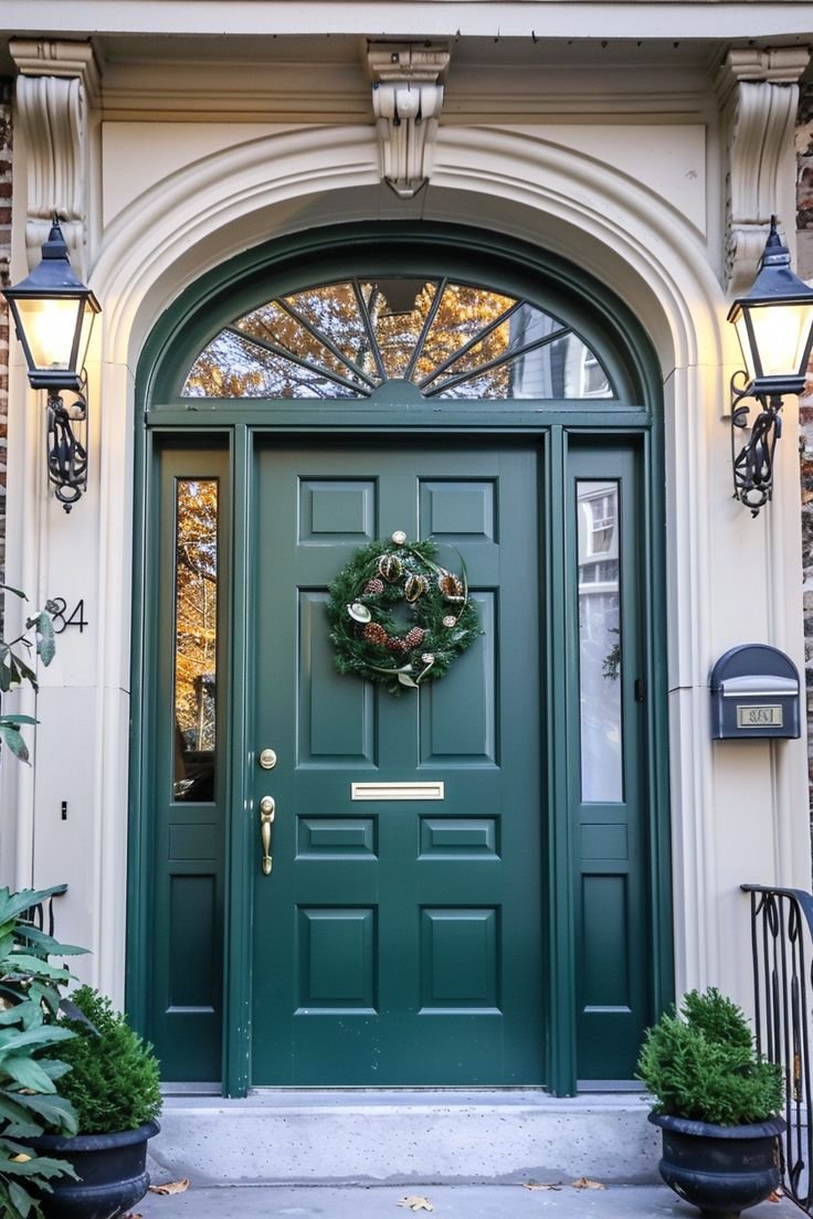
2. Hunter Green — The Color That Made It on Merit
Hunter green is the most proven front door color in the history of residential architecture. That’s not hyperbole — it has appeared on distinguished homes across centuries, continents, and architectural styles, and it has never looked wrong on any of them.
The reason is that hunter green operates more like a warm dark neutral than a statement color. It carries the authority of black without black’s coldness. The richness of deep navy without navy’s tendency to read as a specific color direction. It adapts to whatever surrounds it while maintaining its own unmistakable character.
The classic formula: hunter green door, polished brass hardware. Round out the hardware with Brass door knocker, Brass kick plate, and Brass house numbers. The result consistently looks more deliberate and expensive than it is.
The limitation: Cool-toned exteriors. Hunter green’s warm undertones create visual tension against blue-gray siding or silver-toned stone. If your home’s exterior palette is primarily cool, there are better options further in this guide.
3. Olive Green — Patient, Organic, and More Interesting Than It First Appears
Olive green requires a homeowner who’s willing to value subtlety. For those homeowners, it’s a genuinely exceptional choice.
It lives between green and brown, giving it a naturalistic, earthy quality that reads as rooted and authentic. Olive doesn’t announce itself. It establishes itself — gradually, quietly, in a way that earns sustained appreciation rather than an immediate reaction.
On properties where the setting and the home are meant to feel continuous — wooded lots, naturalistic gardens, stone-edged paths that blend cultivated and wild — olive green is outstandingly effective. The door reads as part of the landscape rather than placed in front of it. That sense of belonging is rare and valuable in exterior design.
Against dark exterior schemes — charcoal, deep brown, dark gray — olive also performs well, bridging the gap between very dark siding and green without the visual conflict that other greens might create.
The consideration: In low light or deeply shaded entries, olive can go flat or muddy. Test specifically in your door’s actual lighting conditions. Showroom light is not representative of your entry.
4. Emerald Green — When Understated Isn’t What You’re After
Emerald green is the choice for homeowners who’ve decided that their front door should be the defining visual element of their entire exterior. It will be.
Emerald is a true jewel tone. Fully saturated, dimensionally rich, and unequivocally luxurious. It doesn’t ease into a composition — it takes command of it. The effect on an entryway is closer to a design decision than a paint color. It transforms the ordinary into the intentional.
White trim is mandatory — bright, crisp white against the density of emerald generates the visual impact that makes people slow down. That contrast is not optional. Without it, even a well-chosen emerald can read as heavy rather than opulent.
Hardware shapes the overall character. Matte black handles and hinges push emerald toward contemporary sharpness. antique brass returns it to classical richness. Both are correct choices — the home determines which fits better.
Emerald performs at its peak on doors with genuine architectural depth: panels, applied molding, sidelights, transoms. Details give emerald something to animate. On a flat, featureless door, consider starting with a paneled door. The combination of a well-crafted paneled door and emerald green delivers one of the most impactful and achievable exterior transformations available to homeowners.
5. Forest Green — The Front Door Color of Homes That Endure
Forest green is not the most obvious choice. It’s the most lasting one.
Darker than hunter and quieter than emerald, forest green carries a visual gravity that communicates permanence. It reads as the color of a home that has been here for a long time, has been cared for throughout, and will continue to be. That kind of authority is genuinely rare in exterior design.
Traditional architectural forms are the natural home for forest green. Colonial proportions, Federal symmetry, classic American vernacular construction. Against ivory trim and black shutters, with a solid paneled door form, the overall effect is curb appeal that measures its relevance in decades.
There’s also a perception dimension worth noting. Research on buyer behavior consistently shows that deep, rich greens communicate care and thoughtfulness at a subconscious level. A forest green door doesn’t just improve the visual character of the exterior — it changes how the entire property is interpreted by everyone who approaches it.
For homeowners thinking about long-term investment — in personal satisfaction and eventual market positioning — forest green is among the soundest exterior paint decisions available.
6. Mint Green — Light, Memorable, and Entirely Its Own Category
Mint green is for the homeowner who wants their door to be the thing their home is known for on the street. And who’s fully comfortable with that.
It’s light, fresh, and immediately cheerful in a way that’s instantly appealing. In the right context, it’s one of the most charming and memorable front door choices available. In the wrong context, it tips from charming into casual in ways that are difficult to reverse with accessories.
The contexts where mint succeeds: beachside properties, Caribbean-influenced bungalows, mid-century modern homes with clean geometry and restrained ornamentation, and neighborhoods where personal expression is a design value rather than an exception.
The requirement for mint to read as sophisticated rather than playful: absolute restraint in everything surrounding it. White or near-white exterior. Minimal trim detail. No competing accent colors anywhere on the facade. The door must be the single color moment in the composition. Apply that discipline and mint is genuinely exceptional — the kind of exterior feature that neighbors describe by color rather than address.
7. Eucalyptus Green — The Right Green for Cool-Toned Homes
Eucalyptus green has become one of the signature exterior accent colors of thoughtfully designed contemporary homes in recent years — and the reason is straightforward.
For cool-toned exteriors, most greens create problems. Warm greens conflict with blue-adjacent siding. Neutral greens disappear against pale stone. Eucalyptus solves both problems simultaneously: it’s cool enough to harmonize with blue-gray, white, or stone exteriors, and green enough to provide genuine, readable color.
On the right house, eucalyptus reads as though the exterior was conceived as a unified composition rather than assembled from separate decisions. That sense of integration is the hallmark of a designed exterior rather than a painted one.
It pairs naturally with matte black hardware, concrete planters, and modern house numbers. The modern-organic register — clean forms, natural materials, quiet colors, considered details — is precisely where eucalyptus belongs.
The final element: Frame the door with potted greenery — living plants when possible — and the entry transitions from an accent color to an integrated part of the landscape. The door doesn’t sit in front of the exterior. It participates in it. That’s the difference between a great paint choice and a fully resolved exterior design.
Five Steps Between You and a Front Door You’ll Be Proud Of
The shade is identified. Before a single drop of paint goes on the door, here is the process that separates front doors people love from the ones they quietly wish they’d thought more about.
1. Get a physical sample before you commit to a gallon. Screens render color unreliably. Every device has different calibration, brightness, and color profile. Order a peel-and-stick swatch or paint a test section on the actual door. Observe it over multiple days — morning, midday, dusk. The color will read differently in each light condition.
2. Know your fixed constraints before choosing the variable. Roof material, masonry type, driveway, hardscape path — none of these are changing. Your green needs to work with all of them. Map them before you lock in the shade.
3. Select sheen as a design decision. High gloss amplifies depth and exposes every surface imperfection. Satin is forgiving and reads as appropriately polished for most residential applications. Matte can be striking on certain contemporary doors but shows wear more quickly. Choose the finish deliberately, not by default.
4. Always paint the edges. When the door stands open, the edges are visible. A beautifully painted face with unpainted or contrasting edges looks unfinished. Matching the edges takes minimal additional time and is the clearest signal of a professional result rather than a DIY one.
5. Verify across the full calendar before committing. Deep hunter green under a fall wreath in autumn looks outstanding. Does it also work alongside summer planters in July? The best front door colors maintain their appeal in every season. A shade that only works in October will feel wrong in every other month.
You Already Know What to Do Next
You came here with a front door that wasn’t working. The shade, the reasoning, and the testing process are all in front of you now.
The gap between knowing and doing is the only one that remains.
The familiar option: More research. More comparisons. More months arriving home to an exterior that makes you feel nothing, or something slightly wrong.
The right option: Order the sample for the shade that stopped you while reading this. Put it on the door. Give yourself three days to observe it. Then make the call.
There’s a particular satisfaction that comes with finally having a front door that’s exactly right. Not just visually — but in the way it makes you feel when you arrive home. Every day. Every season. Every time a guest walks up the path and pauses to take it in.
Fresh. Elegant. Unmistakably right.
That’s what the right green does.
Now go find yours.