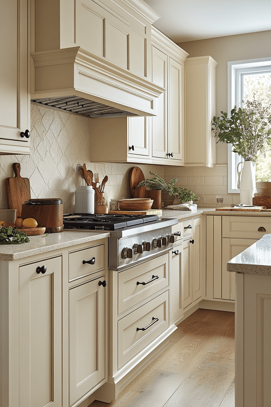
From Pinterest Dream to Reality — 29 Beige Kitchen Tricks That Actually Work
Disclosure : This post may contain affiliate links or paid partnerships. I may earn compensation if you click a link or make a purchase, at no additional cost to you. See my disclosure for more info.
Be honest with yourself for a second.
How many beige kitchen images have you saved this month? Twenty? Fifty? More?
You know the ones. Creamy cabinetry that seems to glow from within. Warm stone surfaces that look like they were carved from the earth itself. Pendant lights made of woven rattan casting delicate shadows across a fluted island.
You feel something when you see those kitchens. A pull in your chest. A quiet voice that says: that’s the one.
And then you close the app.
You look up. And your actual kitchen stares back — fluorescent, flat, uninspired. The opposite of everything you just felt.
Here’s the truth most design blogs dance around.
The distance between those kitchens and yours isn’t about money. It’s about knowing which moves to make. And in what order. And why.
Beige is the most powerful neutral in kitchen design. But it’s also the most misunderstood. Done wrong, it’s bland. Done right? It’s a space that makes people exhale the moment they walk in.
These are the 29 tricks that make the difference. Let’s start with the ones that give a kitchen its soul — because everything else is just a container without it.
Start With the Heart: Finishing Details That Make a Kitchen Feel Like Yours
Most guides save these for last. But understanding the feeling you’re chasing first changes how you approach every other decision.
1. Curate handmade ceramics for your open shelving.
Forget uniform sets from chain stores. What you want is handcrafted — slightly uneven, slightly varied in tone, visibly touched by human hands.
Three vessels at different heights. A stoneware bowl with texture. A mug with visible maker’s marks. These pieces don’t decorate a kitchen. They give it a personality.
2. Let something green and alive breathe in the room.
A small olive tree in a clay pot. Fresh herbs on the windowsill. A single branch of eucalyptus in a vase.
Green layered against warm beige is one of nature’s most effortless masterstrokes. It adds freshness without competing with your palette.
Keep it simple. Keep it alive.
3. Choose a composite sink that vanishes into the countertop.
White porcelain jumps out. Stainless steel clashes.
A composite sink in sand or biscuit melts into your countertop surface. The visual line stays unbroken. The kitchen feels seamless and whole.
4. Group displayed objects in odd numbers.
Three jars. Five books. One board.
Odd groupings are more visually balanced than even ones. This is fundamental design language — silent, powerful, and entirely free to implement.
5. Study your saved kitchen pins and find the hidden pattern.
Open your boards. Really look at the kitchens that stopped your scroll dead.
What do they share? Same undertones. Same textural interplay. Same intentional simplicity.
When you crack that code, you stop guessing. You start designing with the confidence of someone who understands the formula.
The Depth Layer: How Texture Transforms Beige From Flat to Fascinating
Soul is set. Now give the room something to feel.
An all-beige kitchen without texture variation is a painting done in one shade. Technically complete. Emotionally empty.
6. Tile the backsplash with handmade zellige.
Every tile is a small original — slightly different in shade, in surface, in how it plays with light.
In cream or sandy tones, zellige creates a backsplash that breathes with life. It draws people close. They touch it. They study it. They remember it long after they leave.
7. Cover the range hood in hand-applied plaster.
Limewash. Venetian plaster. Roman clay.
Whichever you choose, the textured finish evolves with the daylight — revealing different surfaces and warmth as the sun arcs across the room. A kitchen appliance becomes an art piece.
8. Introduce floating wood shelves in warm tones.
Honey oak. White oak. Light walnut.
Natural wood grain breaks the smooth uniformity of an all-beige space. Float two shelves. Stack your best everyday pieces. Let it look like a life lived, not a magazine staged.
9. Soften the floor with a natural fiber runner.
Jute, sisal, or textured wool along the work zone.
A woven runner absorbs the hardness of tile and stone, warms bare feet, and whispers that this kitchen was designed for comfort — not just appearances.
10. Hang an organic pendant light above the island.
Rattan. Wicker. Woven cane.
One textured fixture throws soft shadow patterns across your beige surfaces, adding visual rhythm that smooth finishes alone can never achieve. It’s the texture punctuation mark.
Small Details, Giant Influence: Hardware and Fixture Decisions
With texture layered in, turn to the small metal elements that carry disproportionate visual weight.
11. Reach for unlacquered brass or champagne gold.
Chrome reads cold against warm beige. Matte black can feel heavy.
Unlacquered brass develops a beautiful patina over time — authentic character that improves with age. Champagne gold offers cleaner, more consistent warmth. Both are ideal.
12. Unify all visible metal finishes.
If mixing metals isn’t in your comfort zone, don’t force it. Same finish on pulls, knobs, and faucet.
Visual consistency reads as intention. Intention reads as quality. Quality reads as luxury.
13. Swap outlet covers for wall-colored versions.
Every white plastic rectangle on a beige wall is a micro interruption. Individually small. Collectively distracting.
Matching covers take sixty seconds per outlet and cost almost nothing. The result: clean, unbroken walls that finally look finished.
The Structural Frame: Cabinet Choices That Shape the Entire Room
Cabinets dominate the kitchen’s visual footprint. They’re the first thing people see and the framework that holds every other design choice together.
14. Root everything in shaker-style door profiles.
Not too minimal. Not too ornate. Perfectly balanced.
Shaker style has endured for a reason — it’s timeless, versatile, and flattering for every shade of beige. If you want a door profile that won’t age out, this is it.
15. Extend upper cabinets to meet the ceiling.
That dusty gap between cabinet tops and ceiling? It undermines every dollar you’ve spent below it.
Ceiling-height cabinets draw a strong vertical line. The room feels taller, more intentional, and dramatically more polished.
16. Split the tones — pale uppers, richer lowers.
Light on top maintains airiness and brightness. A deeper, warmer beige on the bottom grounds the room and hides the inevitable marks of daily life.
Both must share the same undertone. Mismatched undertones create a subtle dissonance that sits uneasily in the subconscious.
17. Add fluted panels to the island.
A flat island front is a design surface going unused. Vertical fluting introduces shadow lines, dimension, and the unmistakable look of custom work.
Small investment. Big perceptual upgrade.
18. Keep uppers handle-free, add hardware on lowers.
No handles on upper cabinets creates a clean, upward-pulling visual line. The room breathes.
Hardware on lower cabinets provides function and tactile interest right at hand height. Calculated restraint.
Making Beige Glow: Lighting Strategy That Changes Everything
Your framework and textures are in place. Now light them properly — because beige without the right light is beige that underperforms.
19. Swap every bulb to warm tones — 2700K to 3000K.
Cool lighting murders beige. It drains the warmth and leaves behind gray, lifeless surfaces.
Warm bulbs give beige its signature glow — the golden, honeyed quality that makes everything feel inviting. Audit every fixture and replace the cold offenders.
20. Layer in under-cabinet LED strips.
Soft light flowing downward across your countertops and backsplash creates depth, warmth, and dimension. Shadows disappear. Textures emerge. Materials become expressive.
At night with overheads dimmed, this ambient layer is everything.
21. Put a dimmer on your primary kitchen light.
Beige shifts visibly with light intensity. A dimmer lets you control those shifts — from bright and energizing to low and intimate.
In a color this responsive to light, a dimmer isn’t optional. It’s essential.
The Anchor Zone: Countertop and Surface Decisions
Surfaces where your hands rest, meals form, and life takes shape. These need to look beautiful and hold up under real conditions.
22. Choose countertop stone with subtle, flowing veining.
Dramatic, bold patterns fight against beige’s gentleness. They hijack the room instead of complementing it.
Quartz or natural stone with soft wisps of taupe, warm gray, or cream. Movement without conflict.
23. Go thick on the countertop edge — two inches minimum.
A thin edge cheapens any material. Period.
A substantial edge communicates weight, quality, and deliberate choice. Mitered, squared, or waterfall — the effect is instant sophistication.
24. Let the countertop flow down the island with a waterfall edge.
Unbroken material from surface to floor creates a seamless, sculptural form. In beige or sand, it looks like carved natural stone — dramatic yet tranquil.
25. Tie backsplash to countertop, not to cabinetry.
When these two surfaces share a material or hue, the eye reads one continuous plane. The kitchen feels more expansive and composed.
Counterintuitive? Yes. Correct? Absolutely.
The Foundation Underneath It All: Getting Beige Right From the Start
Everything above depends on what happens here. This is the bedrock.
26. Identify the undertone before choosing any shade.
Beige conceals its undertone — pink, yellow, green, gray. Each transforms the room’s emotional DNA.
White paper comparison reveals the truth. Undertone first. Shade second. Always.
27. Work with your kitchen’s natural light exposure.
North-facing? Cool, blue-tinted light. Your beige needs to lean warm — gold, honey, wheat.
South-facing? Warm sunlight handles it. A cooler, grayer beige will still feel welcoming.
Ignore this and your beautiful swatch becomes your biggest regret.
28. Live with your paint sample for at least 48 hours.
Morning. Afternoon. Evening.
Three light conditions. Three different versions of the same color. Paint a big swatch on the wall. Observe it for two days. Then decide.
That patience protects you from an expensive mistake.
29. Apply matte to walls, satin to cabinet surfaces.
Matte creates depth and softness on walls. It’s beautiful.
On cabinets? It’s a fingerprint magnet. Satin finish delivers the subtle sheen you want with the easy maintenance daily kitchen life demands.
The Kitchen You Deserve Is 29 Decisions Away
Here’s what it comes down to.
Every stunning beige kitchen you’ve ever saved was built by someone who made smart, specific choices — about light, texture, undertone, proportion, and restraint.
Not by someone with an unlimited budget. Not by someone with a design degree. By someone who understood the mechanics of what makes a space feel right.
You now understand those mechanics.
Twenty-nine moves. Each one concrete. Each one within your reach.
So close the app. Open this list. And start building — one deliberate decision at a time — the kitchen that makes you lean against the counter on a quiet morning, mug in hand, and think:
This is exactly what I wanted. And I built it myself.
That’s the moment all of this is for.
And it’s closer than you think.